As you are probably aware, a resume is your first point of contact with the hiring manager—and this is why having the right resume layout is important. The design of your job application tool strongly impacts its effectiveness as an avenue to get an interview and ultimately land your dream job.
In this article, we’ll explore the key elements that make up a well-structured resume layout, and provide you with invaluable tips to make your job application shine.
What is a Resume Layout?
A resume layout is a crucial element that enhances the overall success of your job application. It is vital in presenting your qualifications and experiences in a well-crafted and visually appealing manner. It involves strategically formatting and organizing various sections and aspects on your resume to allow employers and recruiters to quickly assess your suitability for a position.
Why Resume Layout Matters to Your Job Search
Crafting an amazing resume layout is critical to your job search since it plays a key part in making a great first impression, boosting readability, and showcasing your qualifications. A well-organized resume structure also allows hiring managers to immediately recognize your strengths and increases the likelihood of getting past the application tracking systems (ATS). Moreover, it demonstrates your professionalism and meticulousness, setting you apart from other applicants.
Overall, by devoting time and effort to creating an appealing and well-structured resume layout, you can increase your chances of landing interviews and progressing in your job search.
The 3 Main Formats of a Resume Layout
When developing your resume layout, it is critical to consider the many formats available to best represent your abilities and experiences. Here are a few of the most common and extensively utilized resume formats to assist you in making a good impression:
Chronological Resume
Chronological resume format focuses on presenting your work experience in reverse-chronological order, starting with your most recent job going back to your earliest position. This approach is particularly effective for candidates who have maintained a stable employment history, as it showcases the consistent growth and development within their field. Moreover, by following this format, you can showcase your career progression and demonstrate the valuable skills and accomplishments you have gained over time.
Functional Resume
This format offers a flexible and impactful way to present your qualifications, particularly when your work history may not be the primary focus. The use of a functional resume is also advantageous if you have employment gaps or if your prior experience isn’t closely related to the position you’re applying for.
Combination Resume
Known as hybrid resume, this format effectively blends the best features of chronological and functional resumes. It presents your skills and qualifications upfront, followed by a section on your work history in reverse-chronological order, allowing you to showcase both your experience and relevant skills in a compelling manner. This format particularly works to your advantage when you want to emphasize the breadth of your expertise and demonstrate how your skills align with the requirements of the desired position.
Important Factors to Consider When Designing Your Resume
When crafting your resume, it’s crucial to consider not only the above formats but also the other elements that contribute to an impressive resume layout. Pay attention to details such as font choice, font size, headings, bullet points, and overall visual appeal as it can greatly enhance your resume’s impact.
Here are some helpful hints for each of these elements to aid you in creating an appealing resume layout:
Margin
If you leave the word processor’s default values untouched, it will give you too wide margins (1 inch) on all sides of your resume. This is one thing that you must check. We suggest setting top and bottom margins to 0.3″ and the left and right margins to 0.7″ to keep the sides neat. For us, these make the best margins for a resume.
Column
Placing more than one column on your paper may not organize your details well but will only give an uneven alignment between texts. Use tables instead.
Orientation
Never write a resume in landscape orientation.
Size
The resume standard paper size is 8.5 by 11 inches long.
Page Border
Resumes may or may not contain page borders. If you opt to have a striking design, don’t look for a resume template with borders. You may just place a simple border around the page that doesn’t outshine the texts.
Font
Do not use more than two font styles. If possible, stick to just one type. Choose from Constantia, Book Antiqua, High Tower Text, Californian FB, Georgia, Trebuchet, Palatino Linotype, and Times New Roman. Font size may vary in the entire document (between size 10 and 12 on regular texts and 15 to 24 on the header, depending on the typeface).

How to Lay Out Your Resume
It’s crucial to format your resume in a way that clearly communicates your abilities and qualifications while also being visually appealing. Here are some guidelines that will help you create an efficient resume layout:
1. Choose the best format.
Select the format that best reflects your unique background and highlight your key abilities in the most compelling way.
2. Use a clean and professional design for easy scan.
Go for a clean and easy-to-read design. Avoid using excessive colors, fonts, or graphics that may distract or overwhelm the reader. If you want to add color on your resume, stick to a simple and professional color scheme.
3. Use appropriate sections to highlight key information.
One of the best ways to present your qualifications is to outline your resume and divide your information into clear sections and arrange them depending on the post you intend to pursue. Common sections include are:
Resume Headings
Add your full name, phone number, email address, and your mailing address. Having a clear and concise resume headline allows employers to locate your contact information easily, ensuring they can contact you without any hassle.
Resume Introduction
create a qualifications profile and resume summary that provide a brief introduction of key qualifications and career goals.
Skill Section
Highlight relevant skills that are applicable to the position you’re applying for using a resume skills section.
Work Experience
List your previous jobs, including job titles, company names, dates of employment, and a description of your responsibilities and achievements.
Education
Include your educational background, such as degrees earned, institution names, and graduation dates.
Optional Sections
You can include additional sections like certifications, volunteer work, or professional affiliations if they enhance your candidacy.
4. Keep it clean with consistent formatting.
Keep the overall resume appearance clean and professional-looking using consistent formatting style. Use headings, subheadings, bullet points, and indentation to create a clear hierarchy and make it easier for the reader to skim through your resume.
5. Incorporate white space to create a balanced look.
Incorporate ample white space to improve readability and make your resume visually appealing. Avoid cluttering the page with too much text or information. Use proper margins, spacing, and proper alignment to keep a good balance between texts and white spaces throughout the document. This reflects how neat you are as a person, something that could impress the hiring manager.
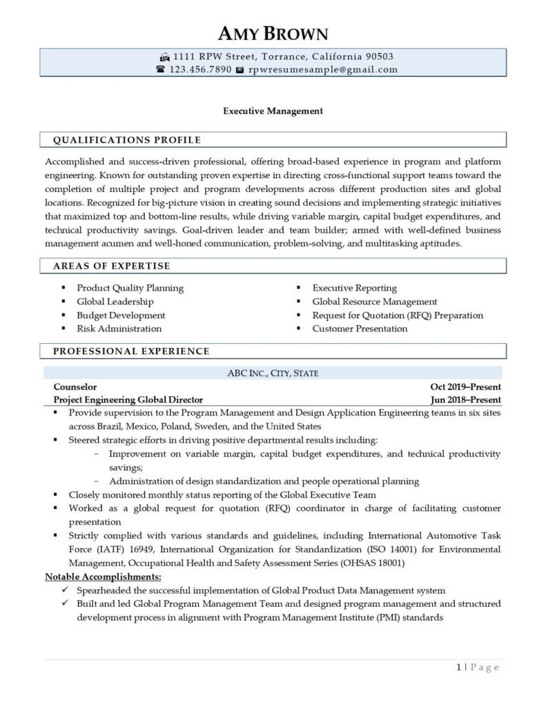
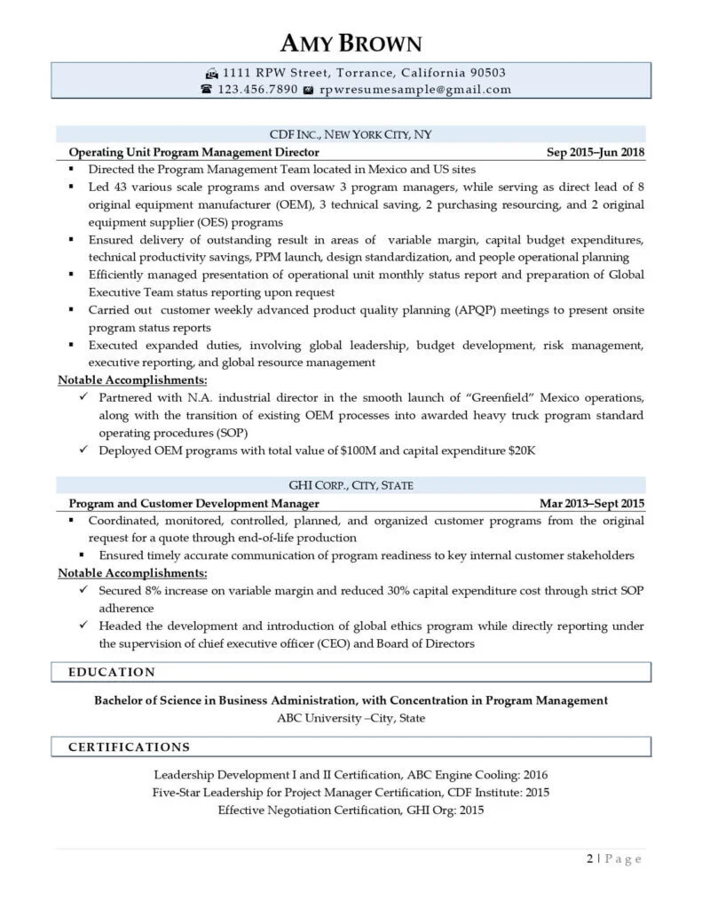
Resume Layout Examples
Craft A Perfect Resume Layout with the Help of Our Experts
Crafting the perfect resume goes beyond just listing your qualifications and experience. It involves paying attention to the layout and design of the document, as it plays a crucial role in catching the attention of potential employers. By incorporating the additional tips we’ve discussed, you can create a visually appealing and well-structured resume that effectively highlights your skills.
Still not confident about your ability to create an impressive resume layout? Don’t worry; our team of professional resume writers is here to assist you! With their expertise, they know the writing techniques that can make your resume stand out to hiring managers. Allow us to handle the formatting and styling of your resume, so you can present a polished and appealing document.
Contact us today and let us elevate your resume to the next level.