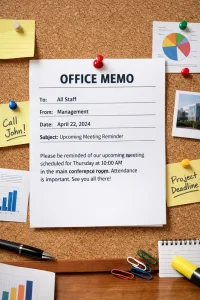
Choosing the Best Font for Resume: Will It Make a Difference?

5 min read

First impressions last, especially when it comes to job search. Unfortunately, you only have one chance to create this lasting impact. One thing that makes it more challenging is that you need to ace it without personally presenting yourself in front of your hiring managers. Hence, you need a strong job search tool which can properly show your strong suits. This is the reason why you put effort in writing your resume and cover letter. Keep in mind that every detail counts. Even the simplest feature, such as your resume font style, affects your whole image as a job seeker. So before you draft one, here are tips on how to choose the best font for resume to help you secure 3x more job interviews.

Psychology of Fonts

Try to walk along the aisles of goods and drinks in a grocery. See how you can clearly distinguish brands based on their labels. For instance, you can instantly point out Coke among other brands due to its color and intricate typeface. Why is this so?

Brains work like complex machines and derive meanings from our senses. Hence, we subconsciously relate aesthetics with certain moods and traits. This is why many firms invest resources to create strong brands. The colors, graphics, and font choice influence their whole label, and later on their success. This being said, you must also think of yourself as part of a marketing team when you’re writing your resume. Choose a font that will signify your top skills and traits.

Likewise, each font family exudes different characters. Knowing this little aspect will help you choose the best font that will match your sense and style. Here’s a visual guide on common font styles and traits linked to them.

Best Fonts to Use for Resume

A Glassdoor report says, most hiring managers spend around 6 seconds for each resume that they receive. So, you better grab this chance to enthrall them with your copy. However, if they find your resume difficult to read, then most likely they will stop scanning and will move it to the rejected pile. Don’t let your chance slip away because of a wrong font choice.

What is the best font to use for a resume? Here’s a list of font styles you can try:

Calibri

Microsoft replaced Times New Roman with Calibri as the default font for Microsoft Word in 2007. Hence, when you create your resume in Word without changing the font, you’re using Calibri. As a result, your resume will surely retain its format no matter where it is sent. Aside from that, this font is also famous for being clean and sleek. When you type in Calibri at a 12-point size, it will produce around 500 to 700 words, the ideal length of a two-page resume. But since this font is a bit common, it might not be the best choice if you want to enter the creative field.

Cambria

This serif typeface is part of a group of fonts called ClearType Font Collection distributed with Microsoft Office programs. Although Dutch typeface designer Jelle Bosma created it for on-screen reading, Cambria looks great on paper, too. Hence, this font is a good pick for both printed and online resumes.

Helvetica

Do you want to give your resume a professional look yet want to add a dash of modern vibe? Try Helvetica. Many designers and typographers consider this Swiss sans-serif typeface to be the king of fonts. With its clean and sturdy lines, many use Helvetica on almost everything. Major brands, such as BMW, use this sans serif font in their brand logos. Hence, this font is best if you’re trying to apply in a design company.

Open Sans

With its tall and wide apertures, Open Sans remains as one of the popular choice for resume writing. This sans-serif font is commonly used in most Google pages, hence it’s also a good choice if you aspire to land a job in a web design company.

Didot

Didot is a unique and classy serif font with an upscale form that can lend style to your resume. Yet, you can only see Didot’s delicate serifs at larger sizes. Thus, we suggest you use this font in headings than in the body. This font style is usually seen in fashion, photography, and other creative fields.

Check these Tips in Writing a Striking Resume Headline

Garamond

The modern version of Garamond can give your resume a classic, yet elegant style that’s much more interesting than the overused Times New Roman. This type can fit more text on a page without crowding your design by tightening up the spacing or sacrificing the readability by lowering the font size. Since this font gives a vintage yet polished vibe, this is commonly used in academic and literary fields.

Lato

Lato is a sans-serif font first designed for corporate use. While this typeface looks neutral in body copy, it has a few unique traits at larger sizes. Łukasz Dziedzic, Lato’s designer, describes the font as “serious but friendly”, making it perfect for resumes for all career fields.

Georgia

If you want to ensure that your resume remains legible even when viewed on mobile phones, then try to use Georgia. This serif typeface is the default font of famous companies such as Amazon, New York Times, and Yahoo. This said, Georgia is best to use if you’ll send a digital copy of your resume.

Avenir

Times New Roman is maybe the most common font of choice for many of us and is the exact reason you should avoid it. You don’t want your application paper to look the same as hundreds of others. So, don’t use this font when you create your resume, but pick something else. Try Avenir, a versatile sans-serif font that boasts of a clean, crisp form. Avenir has multiple weights that can differentiate the sections and features of your resume and give your copy an updated style.

Roboto

Last 2011, Google developed this neo-grotesque sans-serif font for their Android systems. Roboto is known for being sleek, modern, and highly legible which makes it one of the best choice for web and marketing fields. Even if it’s not part of MS Word’s default fonts, you can still download this for free.

Other Resume Fonts You Can Use

  • Trebuchet MS – this friendly and round sans-serif font goes well on screen.
  • Arial Narrow – if you’re tight on space, this sans-serif font is modern and still legible even in the narrow form.
  • Tahoma –this sans-serif font has a more modern glow compared to other typefaces.

Any of these forms will be perfect for your resume as long as you choose the best resume fonts. In addition, use two fonts, at the most, in your application paper to make your resume more professional and less cluttered.

Impress Your Hiring Managers with a Professional Resume

If you want hiring managers to read your resume, invest time and energy not only in its content but on its form, too. Hence, it is important to note that your resume format, style, and design should match the trait or skill that you want to highlight. Find the best font for resume and impress your hiring managers in an instant. Choose an easy-to-read font and make sure it’s universal, so it’ll open on every computer and beat the Applicant Tracking System (ATS) software. Need extra help? Talk to our career experts and learn about the best resume writing services for you.

Scroll to Top